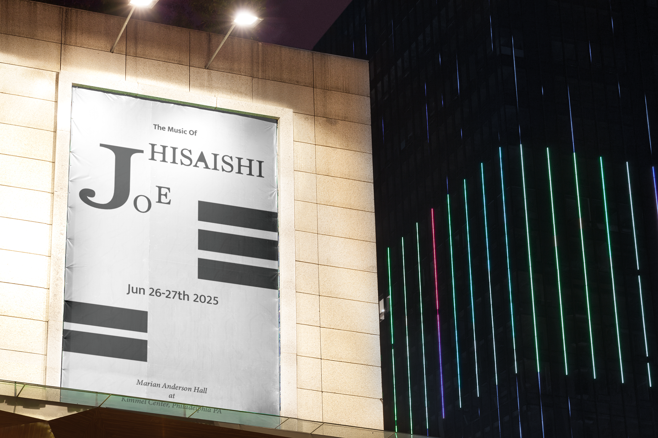
Joe Hisaishi - Music Concert Poster
Medium: Digital Poster
Tools Used: Adobe Illustrator
Design Focus: Typography as a visual language
This poster was created to promote a music event celebrating the iconic compositions of Joe Hisaishi, held at the Kimmel Center's Marian Anderson Hall in Philadelphia. The challenge and concept for this piece was to use only typography and minimal color—no imagery—to convey emotion, mood, and a clear message.
In this design, type becomes the image. I played with scale, contrast, and placement to guide the viewer’s eye and emphasize key information, such as “Joe” and “Hisaishi.” The oversized "J" paired with a scattered "o" and "e" introduces movement and a subtle sense of musical rhythm—echoing Hisaishi’s cinematic and emotionally resonant compositions.
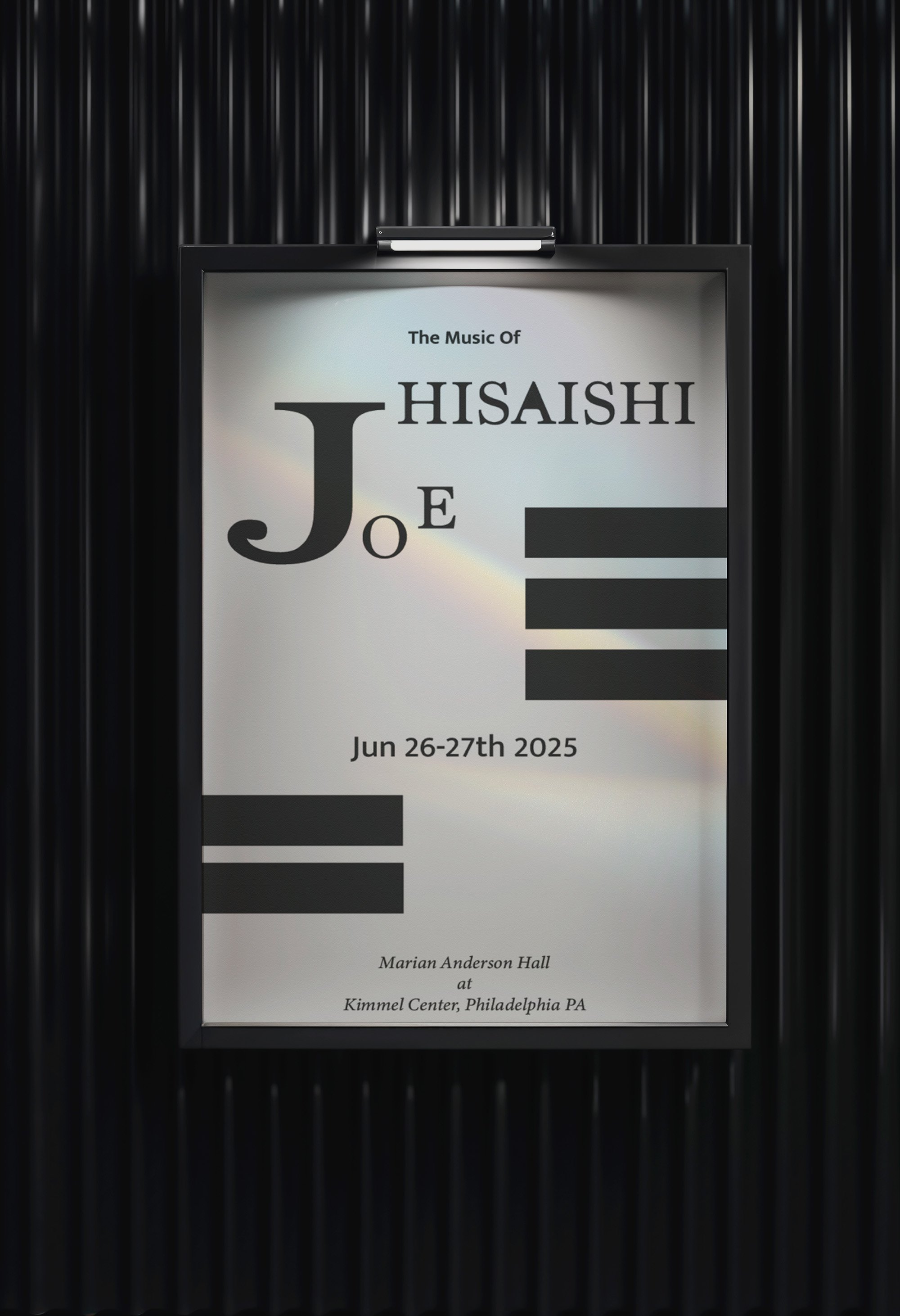

The use of black and white was deliberate: it reinforces elegance, timelessness, and clarity while allowing the typography to remain the central focus. The horizontal black bars visually reference a piano keyboard—an homage to Hisaishi’s primary instrument and compositional style—while also contributing to the structure and visual rhythm of the layout.
With this piece, I explored how typography alone can carry tone, atmosphere, and even narrative, pushing the boundaries of minimalism while maintaining strong communication. This project reflects my belief in the expressive power of type and the impact of thoughtful visual restraint.